MODO701 First Impressions
Modo 701 is a monumental release with some seriously impressive improvements, new features and all around workflow enhancements that make this package one impressive 3D package. Â I’ve going to review a few of my early findings and fun features in a quick feature look. Â I’m not reviewing everything or outlining all the features as Luxology does that best in their own product feature tour.
Render Speed Enhancements
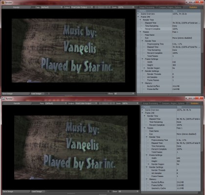
First thing I always review are render speed enhancements. Â I loaded up a simple title effect scene and checked out a comparison of render times in 601 to 701. Â I have to say I’m impressed with a nice speed increase. Â I tested several other scenes I’ve done in modo 601 and all had some improvements in render speed.
This is the same scene on the same machine, nothing else running.  Modo 701: 7m, 30.0s  compared to Modo 601: 9m 46.7s  a 23% increase.  NICE.
General UI Enhancements and Workflows
Sometimes the best features are the little ones. Â There are a few things in the UI that have made a tremendous impression on me and some of them have annoyed me for years in modo, I’ve just come to accept them. Â This first one is the viewport ZOOM button and indicator now. Â In the corer of every viewport, modo shows a couple of new buttons, one for the viewport option and one for the viewport zoom. Â This has traditionally be bound to the keypad enter key to zoom that viewport to its full size and back and its a great feature. Â Finally, there is an indicator to show this state, highlighted when zoomed and with an options button along side. Â I generally do a LOT of customization of my workspace, this new feature helps to see what windows are in what state, as I’m often changing them.
![]()
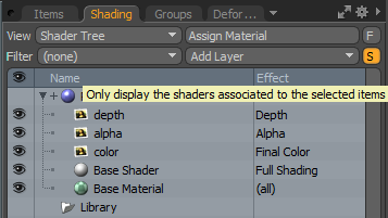
Shader viewport has a few simple filters and views now at the top. Â The best of these features is the small “s” button to only show shaders that apply to the selected content in the viewport. Â So, in huge complex scenes, I now have a simple way to view the relevant shaders only. Â This will save me a lot of time and clocking to selecting materials, which was always the best way to hone in on a material in a list of hundreds. Â This simple feature sits among many in the shader improvements, which are covered below. Â Here is a sample of the new filters and options.

Network Rendering – Shared Buckets
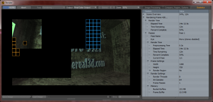
I’ve always been frustrated by Modo’s network rendering and it has alluded most users as to how to get it functioning.  I was one of them.  It would work the odd time but mostly it was just there to annoy me and wish I hadn’t wasted time with it.  Well, so far in modo 701, all my render nodes are properly picking up buckets and rendering along side my main workstation with no problems.  A welcome fix and one that Luxology committed to making work for all users within the modo 701 cycle as they have had mixed results already in the network rendering package.  I can say at least, its worked great for me already and rendering with my small render farm at the helm, which is sweet to see.
For animation rendering, I use SquidNet Pro as a render manager, but either way, its nice to see the buckets flying through the renders and great to know that Lux is improving this area once and for all in the 701 cycle.
Shaders and Items
I love modo’s shader system and while a lot of people seem to want node based shading, I personally don’t like node based and prefer the shader hierarchy. Â There are a few really great enhancements here as well in this release. Â A few that I’ve come across and think are quite useful are listed here and outlined in the video clip below as well.
- Coloring Items in Shaders
- Locking Presets
- Filter by Selection
- View by Materials/Shaders
- References and the Library

